Mascot Stickers


Exterior Decal

Seating Patterns
Mascot Exterior


Interior

Bathroom Sign


Business Card


Menu Outside

Menu Inside

To-go Box Print

Social Posts

Sauce Bottles Front
Menu Print

Website Home

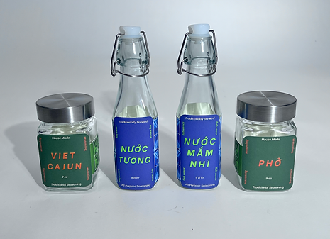
Sauce Bottles Side

Produce Stickers


Information
Homecoming Fusion Kitchen was my last project at Auburn University and spanned the entire semester. The driving force behind this senior project is allowing students to assume the role of freelance designers. The beginning stages of this project include making a brief; including visual direction, deliverables, specifications, brand description, timeline, and design goals. All of these were then approved by a group of professors or our “committee.” Included with this timeline were scheduled meetings with each committee member to receive critique and feedback on our work. Such meetings were integral to improving and making changes as requested. Along with these specific outlines, we were to create and write about the brand from scratch.
Located in Gulf Shores, Alabama, Homecoming Fusion Kitchen blends southern soul food, seafood, and Vietnamese cuisine into a unique Viet-Cajun fusion. Founded by a first-generation Vietnamese American chef, the restaurant aims to create a welcoming space for all Vietnamese people, offering familiar flavors that evoke a sense of home. The name, challenges traditional views of American culture, tackling issues of assimilation and gentrification, flipping entirely its all-American aesthetic. By celebrating cultural storytelling and highlighting the beauty in diversity, Homecoming Fusion Kitchen embraces authenticity, with a brand identity focused on quality craftsmanship over quantity, ensuring a truly meaningful experience.
One of the central themes of this project was storytelling through the lens of illustration and history. Early inspiration included mystical beasts tied to Vietnamese folklore. After being researched and selected, they were given a purpose. The Phoenix symbolizes recovery and rebuilding community spaces, its wings are beckoning you in. The Dragon symbolizes divine protection and home, and it stars as the head chef. The Leogryph symbolizes family and heritage, and it joins the customers for a meal. Each item in the proposed deliverable was also meticulously chosen with real-life use in mind. The design of the menu, business cards, and to-go boxes was rooted in this narrative, with typography that blended two languages to reflect the fusion of cultures. The website was built for easy online ordering and bookings, while social media posts maintained the aesthetic, promoting events and key information. Market materials like produce stickers and sauce bottle packaging further extended the brand’s story. Overall, the project was a rich opportunity for self-initiated research and creative growth, allowing for a deep exploration of cultural symbolism and the interwoven nature of design, food, and community.